Colourpop Element of Surprise Palette review

Hi guys,

Wow third post of the day, go me!

I shall be reviewing another Colourpop palette I ordered, the ‘element of surprise’.

Here it is in all its’ glory!

Now for the inside….

The colours are right up my alley. They are definitely fall/autumn appropriate but to be honest you can rock them any time of year and hey, makeup has no rules right?

It is a very warm toned palette and we probably have these shades in other palettes but the makeup addict in us is probably screaming “yes, but we don’t have them all in one compact palette so you need it!!!”. The colours are stunning though!

So how do they swatch….?

….amazingly!

Unlike the my little pony palette also by Colourpop (review here), the colours are more pigmented and vibrant. The only 2 shades that require more work are the matte shades in the middle row, the lighter one being slightly chalky compared to the rest and the dusty rose just needed to be built up. This does not reflect on how the eyeshadows perform on the eyes! Swatches can be used to determine texture and colour but they can be quite misleading in terms of pigmentation and how blendable they are. Sometimes an eyeshadow may swatch horribly yet go on really well on the eyes and vice versa. However, from what I have heard and my experience with this palette, the shadows are just as amazing on the eyes! They feel very smooth and buttery when swatched.

The coppery shade that is second in the top row did have some fallout but only minor. The four very shimmery shades are very pigmented and have a foiled appearance, beautiful! And that pop of pink is also rather lovely!

Here’s how Colourpop have described the shadows in the palette on their website…

Feels: metallic soft opalescent pink

Late Night: metallic copper with gold duochrome

Silk Street: matte purple-fuchsia

Rayon: metallic dark coral with blue-green duochrome

Go With the Flow: matte true peach

Subdue: metallic lavender with blue-green duochrome

Opulent: metallic bright true fuchsia

Labyrinth: matte dusty pink

Blank Canvas: matte deep maroon

Sea Stars: matte medium yellow brown

Details: matte smoky burgundy sprinkled with hot pink glitter

Peace of Mind: metallic bright burgundy

(From the Colourpop website).

I bought this palette directly from the Colourpop website for $16 which works out to be just over £12 which seems an absolute bargain. You get free international shipping if you spend over $50 but then us U.K. folk are hit with a hefty customs charge of around £17-19 which you have to pay before your item can be delivered (outrageous!).

I do think the palette is worth the money especially if you can pick it when visiting the states. It does not have a mirror (saving you $2!) so take that as a plus or a minus depending on whether you use the mirrors in your palettes.

I’m really enjoying Colourpop’s pressed shadow formula especially in this palette!

Will you be picking this up? Or have you got another makeup love in your life?

Thanks for reading!

Sadiyah xx

Colourpop My Little Pony Palette review

Hi guys!

Today I will be reviewing this little baby…

Colourpop’s ‘my little pony’ palette!

I ordered my palette off the colourpop website and I did incur a customs charge of £19, way more than the actual cost of the palette!

So you’ve seen the front of the palette, it’s gorgeous with the rainbows and ponies all over it! Very cute but some may find it quite off putting and feel as if they have kids’ makeup.

Here’s the back with all the names of the shades. I find it slightly annoying when brands do that as I (like many others!) find it difficult to tell whether the name of the shadow is directly behind it or if you read it in order of the shadows.

Also there’s no mirror inside!

And here are the shadows inside….

And swatches in order….

I have another palette from Colourpop and that one seems to have better pigmentation but that’s not to say this one is terrible. The only colours I had to search a few times were the white shade in the top row and the shimmery purple in the second row.

The top row seems quite warm with two beautiful lid shades and two highlighting shades on each end both matte and shimmery. The matte white could also be used to set your primer.

The middle row is very purple and the two matte shades (although looking quite pink in the swatches, they are definitely purple/red) can be used in the crease for both warm and cool toned looks.

The bottom row is full of shimmers, all cool toned. The first shade in the bottom row is definitely not black, it is a dark purple.

Although it’s not packed with tonnes of different shades you can actually make a surprising amount of looks with it.

Overall I am glad I bought this palette but it didn’t wow me, I guess I only bought it for the packaging!

Guys I am guessing it’s a limited edition palette due to the release of the my little pony movie out in cinemas now, so if you like the look of it be quick!

It costs $16 with free international shipping over $50 so I did pick up a few other bits. REMEMBER FREE SHIPPING DOES NOT MEAN THERE ARE NO FURTHER CHARGES! Depending on where you live you may incur a CUSTOMS CHARGE that you have to pay before your package can be delivered.

I hope this was helpful and that you enjoyed!

See you next time loves!

Sadiyah x

Too Faced Clover Palette Review

Hi guys! Today I will be reviewing the new limited edition Clover palette by Too Faced. I ordered it as soon as it launched on their website as I believe it will only be sold there and not in stores and as I live in the U.K. I had to wait longer for delivery. I only just received it this morning and I had to do a review and swatches!

Outer cardboard packaging.

Actual palette (front and back).

The packaging on this palette is soooo cute! Clover being the main attraction with the rest of his buddies. You have a few familiar characters like the peach from the sweet peach collection as well as the slice of bread from the PB&J palette. All the characters are raised and the palette itself is the standard tin packaging from Too Faced with a magnetic closure. I do wish Too Faced would create palettes with a snap shut closure as it gives me anxiety thinking a palette hasn’t been shut properly! The sound of something snapping shut is so satisfying as well!

As I am reviewing this palette I have a cold and a stuffy nose. Why am I telling you this? Because I had heard (unofficially) this palette would be scented but I can not confirm this as true or false since I can not smell a thing!

On to the inside of the palette….

You have a large mirror which I think is considerably larger than the mirrors in the chocolate bar palettes and sweet peach palette. I wouldn’t use those mirrors to do my makeup but I would use this one!

The colours in the palette are beautiful! It’s not a neutral palette as many of us will have more than enough neutral palettes in our collection (how many matte brown shades do we need?) and let’s be honest the market is currently oversaturated with warm toned palettes such as the Urban decay naked heat, tartelette toasted, morphe palettes, viseart warm mattes, the very popular ABH modern renaissance palette, need I go on? This palette has quite a few pops of colour but it’s not completely unwearable and the change is refreshing!

Now on to the swatches (sorry for the weird angles!)…..

Top row (L-R): puppy eyes, lucky clover, chihuahua, fur baby, #SaveThemAll and spoiled.

Puppy eyes: shimmery white with glitter. This shade is not very pigmented and was quite the disappointment! It leaves the faintest white pigment with tonnes of glitter. I would have preferred a matte white to set my base and to highlight my brow bone with.

Lucky clover: I can’t seem to tell if this green shade is a satin or a matte! It seems like a weird hybrid! Again not overly pigmented and provides a sheer wash of colour (it had to be swatched 3 times for it to show up!).

Chihuahua: matte light brown. Now this is the smooth, buttery formula I am used to from Too Faced mattes! It’s pigmented but blends out beautifully and is perfect as a transition colour.

Fur baby: matte brown. Again, very impressed with this shade much like chihuahua. Pigmented, smooth and buttery! Good colour for the crease.

#SaveThemAll: shimmery chocolate brown with gold specks of glitter. Expect major fallout with this shade! Although it is pigmented, it feels very gritty and requires a bit more work to blend out.

Spoiled: shimmery aqua almost a duochrome with gold. Pigmentation of this shade is ok, I would use it as a lid shade as well as under my lower lash line. Not a bad shade but it didn’t wow me like I thought it would.

Middle row (L-R): I ruff you, paw print, ruh roh, love is love, wet kisses and woof.

This row has better pigmentation (bar one shade) than the top row.

I ruff you: satin baby pink. Could be used to highlight inner corner and even your brow bone as when it’s blended out it looks white with a hint of pink. Again, decent pigmentation.

Paw Print: matte taupe purple. Initially when searching it felt very rough and dry and I was hardly getting any pigmentation and I was not happy as that is a good transition/crease shade for a cool toned look. However, swatching it now it feels less dry and slightly smoother so it may have just been the top layer that was difficult. I think the more I get into that shade the better it will be but right now I don’t totally hate it.

Ruh roh: shimmery dark cranberry. I really like the pigmentation of this shade! It’s not a very smooth shade but it’s very pigmented and easy to blend. Excellent lid colour for a fall/autumn eye look!

Love is love: matte pink. This shade is not overly pigmented but in a good way. Although it is bright it can be used as a transition shade to warm up your eye look. If you wanted to use it as an all over lid shade you can definitely build it up by packing it on and layering it.

Wet kisses: a colour quite hard to describe! I would say it is a shimmery tangerine salmon or a very warm copper shade with pink tones. However you would describe it, we can all agree on how stunning it is! Quite possibly my favourite shade and formula. Soft and buttery feeling and so pigmented! It would pair perfectly with ruh roh for a halo eye!

Woof: matte charcoal. This shade is not black, it is a pigmented charcoal/dark grey. It could still function as a black shadow to line your lashes or smoke out your lower lash line or deepen the outer v, it just wouldn’t be as intense. Also, it is one of the more drier mattes in the palette, nothing like chihuahua or fur baby which are buttery.

Bottom row (L-R): cuteness overload, best friends, cuddle buddy, daddies❤️me, TF mascot and good boy.

Cuteness overload: shimmery pink. Good pigmentation, nice colour and easy to blend. Would be a great lid shade or inner corner highlight. I like it but it’s the kind of shade you find in a lot of palettes.

Best friends: blue brown duo chrome. An exact dupe for MAC’s blue brown pigment! Very good pigmentation, great lid shade.

Cuddle buddy: matte chocolate brown. The most pigmented matte in the palette. I expected it to have the exact same formula as chihuahua and fur baby and feel just as soft and buttery as they do but again this is on the more drier side and swatching it I can feel it’s a little scratchy almost. It also requires a bit more work to blend. However, it’s good for deepening up the crease or even using as a crease shade for deeper skin tones.

Daddies❤️me: matte cranberry. Just like love is love, this shade is not that pigmented. However, unlike love is love it requires a bit more work to blend out. It would be great in the crease for either a cool or warm toned look.

TF mascot: shimmery purple. I think Too Faced has used the exact same purple that was in the PB&J palette (and that’s not a bad thing). I quite like how this shade is bright yet quite sheer as well.

Good boy: matte yellow with micro glitter. It’s hard to find a good yellow but I think with a good primer this shade has real potential. I’m excited to use this on my lids!

My thoughts on this palette….

Packaging: I adore the packaging and the design on this palette it’s just so stinking cute!!! However it might be a bit too cutesy for some who may think it looks more like children’s makeup rather than something from a high end brand. I still give it a 9/10.

Shade range: I love the colours in the palette as it’s not too warm and not too cool; it’s not full of boring neutral shades and has some great pops of colour but you do have your everyday staple shades e.g. transition/crease shades so you wouldn’t have to use another palette alongside it. You can create simple everyday neutral looks as well as more fun and colourful looks so I think it caters to a lot of people and for that I give it 8/10.

Pigmentation: I think this category lets the palette down slightly as some colours are just not that pigmented (puppy eyes and lucky clover, I’m looking at you!) and I think a lot of the colours could do with having stronger pigmentation but that’s not to say it’s a completely unusable palette, I give it a 6/10.

Who do I think this palette is for?

  • Beginners who don’t want really pigmented shadows.
  • Makeup fanatics who collect palettes.
  • Lovers of Too Faced.

This palette is limited edition (boo!) so if you like the look of it snap it up here on the Too Faced website before it sells out! Too Faced are donating $250,000 to Best Friends Animal Society which I think is absolutely awesome!

Hope you enjoyed,

See you soon!

Sadiyah xx

MAKEUP FOREVER ARTIST SHADOW PALETTE 3 – REVIEW!

Hi all! To celebrate becoming a fully qualified teacher before Easter, I have been treating myself ALOT as those of you who have done a teacher training course before know how ins tense it is. I’ve mostly been buying makeup; mainly palettes.

I’ve never tried anything from Makeup Forever and I really wanted to check out their eyeshadows as I’ve only heard good things. When Debenhams released the Rebellious Flower Artist shadow palette I knew I had to have it!


So this is what the palette looks like. I love the packaging! It is lightweight and has a strong magnetic closure. The palette comes with a mirror inside along with 9 shadows.


As you can see it’s not a neutral palette as it has some amazing colours in there but you could create a somewhat neutral look. I must warn you though none of the shades on here are matte so you may need a couple of extra matte shadows for your transition and crease colours.

The shadows have an almost wet consistency and feels like a gel powder shadow which is something I’m not used to so it does take some getting used to. But most of the shadows are very pigmented apart from the yellow shade in the bottom left corner.

Here are some swatches….


Although I have only swatched the shadows I’m positive you can create some amazing looks with this palette. I bought mines from Debenhams for a reasonably priced £28. I haven’t seen it on the website recently but it has made a few reappearances on the site. I definitely recommend it if you want to try out the Makeup Forever Shadows!
Sadiyah xx

Laura Mercier Extreme Neutrals Palette – 1st impressions/review!

Now I love collecting palettes and my collection is ever growing with no signs of stopping with all the new palettes coming out recently. My favourite palettes are eyeshadows and I may not wear them every single day but it makes me happy knowing I have a variety to choose from.

Laura Mercier just recently came out with a new palette; the extreme neutrals palette. Now I’ve heard great things about their past palettes and since they are always limited edition, I thought I would snap this up before I missed out.

So here’s a few shots of the packaging…


Outer packaging.


Actual palette.

In my opinion, the packaging isn’t the most appealing. I wouldn’t say it’s bulky but it could do with being slightly slimmer for what it is. Also, the colour of the palette is (dare I say) somewhat ugly. It almost resembles a snake print design but it doesn’t look as sleek and classy as what you would expect.

The palette has a magnetic closure which I find quite fiddly to open but you have that peace of mind knowing it won’t open so easily in your bag if you take it travelling with you.


So this is what the palette looks like from the inside. You have a decent mirror and 12 neutral-ish shades.


Surprisingly, this palette has quite a few mattes which makes a pleasant change from only having 2/3 matte shades in something like the naked palettes. It has a total of 6 mattes. Point Mercier I think!

Something that slightly disappoints me is the fact that there are no names next to the shadows but you can find them at the back of the palette and not on an annoying plastic insert which I tend to lose after a few days!

Now on to the actual shadows themselves. The tone in this palette are definitely neutral, not too warm or too cool but right slap bang in the middle so it’s great for all skin tones. I’m going to start of with a positive first, the mattes definitely feel creamy when they are swatched but the lighter shades can appear a little chalky but they have decent pigmentation. Now a negative; the shimmer shades lack pigmentation especially the fourth shade in the top row. It is a beautiful pale yellow gold but it just doesn’t show up well as the pigmentation is just not there. I really had to pack it on to get a decent swatch. The other shimmer shades are okay but just OKAY…they don’t have a patch on something like the shimmers urban decay has.


Swatched of the shades. Top row is on the right and bottom row on the left. You can see that gold is really faint.
Overall I would give this palette a 6/10.

PROS

  • Good amount of matte shades for transition, crease, outer v and highlight.
  • Matte shades are smooth and creamy and decently pigmented
  • Great for both warm/cool tones

CONS

  • Pigmentation lacking in shimmer shades
  • Gold colour does not show up well
  • Expensive for what it is.

With this palette I do think you are paying for the brand at £45. I think if you are looking for a first high end palette go for something like the naked palettes or the chocolate bars from Too Faced.

What do you guys think of it? Let me know.
Have a great day!

Sadiyah xx

NARS Pure Matte Lipstick Review

So taking a break from my eyeshadow palettes, I thought I produce a post about some of my high end lipsticks. Now I have a fair few high end lippies (not including MAC) such as NARS, YSL, Clinique, Charlotte Tilbury and Urban Decay. I can’t choose between lipstick or eyeshadow being my favourite makeup but I love them both so much!


Today I will be talking to you about my NARS Pure Matte Lipsticks. I wouldn’t really call this a collection as I only have 2 of them.

2016-03-30 13.17.412016-03-30 13.18.10

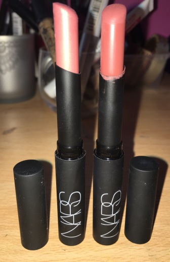
First of all, I love the packaging! Each tube is super slim and it looks quite high end to me. The packaging is matte black and almost has a rubberised feel to it. It has the ever famous NARS logo on the tube and “pure matte lipstick” is printed on the other side.

Because the tubes and bullets are so thin, I think this makes for easier application for those with thinner lips as it is more precise. However, for those with a more fuller pout, it takes longer to apply than lipstick from a standard sized tube.

I don’t find them to be particularly scented either which is a good thing as some people are sensitive to fragranced makeup/skin care products.

So let’s take a look at the first shade.

2016-03-30 13.19.46

BANGKOK

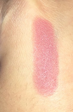
So this first shade is called ‘Bangkok’. It’s a mauve nude shade that’s perfect to wear everyday. It is a matte BUT this particular shade has tiny glitters in it which I’m not too keen on. Here’s how the shade swatches…

2016-03-30 13.18.23

And here’s how it looks on my lips…2016-03-30 13.19.22

You can sorta see the tiny specs of glitter in the tube and on my lips.


Moving on to the next shade…

2016-03-30 13.19.59 TONKIN

This is my favourite shade out of the two and is most used (as you can clearly see!). It is a deeper version of Bangkok minus the shimmer. This is a true matte shade. it is mauve with strong hints of brown in it. I wear this as an everyday shade and it reminds me a lot of ‘twig’ and ‘velvet teddy’ by MAC.

Here’s how it swatches…

2016-03-30 13.18.38

And here’s how it looks on my lips….

2016-03-30 13.18.57


Now on to the wear time and how they feel on the lips.

When I initially apply them, they feel creamy but not as creamy as a matte lipstick from MAC (regular mattes, not retro mattes). however, the creamy feeling soon disappears once they have dried and sort of set on to your lips. When you rub your lips together, they sort of drag against each other. It’s not the most comfortable formula and feels slightly drying so if your lips aren’t moisturised before application, it will cling to dry patches and accentuate them. BUT….once they are on your lips, the longevity of the wear is excellent. They last a lot longer than a regular MAC matte lipstick and I find they don’t transfer as much either.


There are more colours available in this line and I do plan on getting more as I really do like these lipsticks. You can pick them up from John Lewis for £21 as I did. I do recommend trying them out and I give them 7.5/10!


I hope you enjoyed reading my post!

Sadiyah xx

Dior Addict Lip Glow Review


I love taking care of my skin, my lips included. In the cold winter months my lips become dry and crack and I soothe them by applying lip balm and I moisturise them everyday to keep them soft and supple. So naturally, I’ve gone through tonnes of lip products and I have a large collection ranging from the body shop to Nivea to Vaseline to carmex! Most of them are great but some dry out my lips further through continuous usage which is a shame.

I decided to treat myself to a high end lip balm and it was a choice between Dior and Bobbi Brown. Since I already have a couple of Bobbi Brown products which I love, I decided to branch out and try Dior. I purchased the Dior Addict Lip Glow Lip Reviver Balm from John Lewis. There were 2 shades available; coral and pink and I bought mine in pink.


 I really like the packaging of this and it definitely looks like a high end lip balm to me. It has the Dior logo at the bottom of the bullet and the product itself is dispensed from a handy twist up tube. It has a minty smell to it which isn’t overbearing but some may disagree. I don’t know why but every time I think of Dior I always think of roses and I do think a more floral or sweet smell would have suited the product better, but again some may disagree. But anyway yes I do love the way this lip balm is presented.

But that’s as far as my love for the product goes.

First of all you don’t get nearly enough product for the £24 you pay.

I’ve only ever used it like four times so it’s still pretty new but you can see it’s fully twisted to the top and you only get a quarter of the size of the tube so this is actually quite deceiving!

Once I apply it to my dry lips it somewhat moisturises them but not as much as something like my Nivea lip balm would do. After a while it also begins to feel slightly gritty on the lips. Now this could actually just be me because I’ve had the same experience with other lip balms. Now this would have been ok if I was able to wipe it off after 10 minutes and have lovely soft lips but the worst thing is it just sits on top of my lips and doesn’t sink in! And by the time it wears off through eating and drinking my lips are left still feeling dry.

The lip balm itself is slightly tinted and it claims to leave a slight rosiness to the lips with a lovely sheen. It also changes throughout the course of the day. It looks beautiful in the tube and after googling it I saw how it looked on others and I was impressed and I think that’s what swayed me to buy it. I should have researched further and realised that the result varies on the pigmentation of your lips and your skin tone.


Top – bare lips

Middle – just after applying Dior Addict Lip Glow

Bottom – 15 minutes after applying Dior Addict Lip Glow
Once I first apply it I think it just looks like I have greasy lips although they do look more rosey toned than my bare lips. However, you can definitely see the change in the final picture as my lips looks a lot more pink and have that beautiful glossy sheen.
Overall I think this product is a let down for me and just goes to show you shouldn’t buy somethings just because the Internet is hyping it up! I wouldn’t recommend buying it without trying it in store first. But I do suggest checking it out as for some it may turn out to be HG status but for those like me it may just be a disappointment. I much prefer my £1 lip salve from Boots for moisturising my lips and although it makes your lips look pretty, I feel you can get the same effect with MAC’s ‘syrup’ lipstick which is almost £10 cheaper or you could even use a tinted gloss.
I hope you enjoyed reading this.
Sadiyah x

Too Faced Natural Matte Palette Review 


So today I will be reviewing another one of my palettes; the Too Faced Natural Matte. I bought mines from Debenhams for £32. This palette has been out for a while now and I’ve had mine for a good few months so I’ve had enough time to use it and evaluate its performance in terms of pigmentation, blendibility and longevity.

This is the companion palette to the Too Faced Natural Eyes palette which has a mixture of matte and shimmer shades and there are actually 4 repeat shades in this palette; Heaven, Cashmere Bunny, Sexspresso and Nudie (from the newer natural eyes palette).

So this palette has 9 all matte shades, no shimmer or glitter in sight! I love all Too Faced shadows but there always seems to be one shade in the palette that either lacks pigmentation or has substantial fallout due to the glitter. But this palette has no fallout and is so richly pigmented! The texture of each shade is so smooth and creamy and they all work beautifully and I am really impressed! I haven’t got a single bad word to say against the pigmentation and the formula is near perfect as each shade blends like a dream and with a decent primer they all last on your lids pretty much the whole day.

I’m not the biggest fan of the packaging though as although it looks beautiful with an elegant lace design and is small and compact, the magnetic closure leaves me feeling less than confident when travelling with it. But this is a minor flaw for such a brilliant palette.

So let’s take a look at the actual colours in the palette…


Top row

Heaven – cream/bone matte. Perfect as a base for the rest of the shadows and as an inner corner and brow bone highlight. Feels slightly chalky when swatched but it applies evenly to the eye with good pigmentation.

Cashmere Bunny – taupe matte. I use this as a transition shade for a more cool toned look but it also looks great on the lid.

Sexspresso – deep chocolate brown matte. This can be used to deepen up the crease for both a warm and cool toned look. Very pigmented.


Top – Heaven

Middle – Cashmere Bunny

Bottom – Sexspresso

Middle row

Lace Teddy – Peachy pink matte. Another colour that can be used as a base for other shadows. But I use this on my lid as it makes my eyes look really bright and open and makes a nice change from having a white lid shade.

Strapless – Red toned brown matte. I use this in the crease for a warm look. Because it is so pigmented you only need to tap your brush lightly to pick up the right amount of product.

Risqué – cool toned deep brown. I find this to be a very multifunctional shade. I use it as a liner when I want a slightly smoky day look as well as to smoke out my lower lash line. I have even used it to fill in my brows because it is so cool toned. And it can definitely be used to deepen your crease or as a definer.


Top – Lace Teddy

Middle – Strapless

Bottom – Risqué

Bottom Row

Nudie – mid toned brown matte. This shade can be considered cool or warm depending on how cool/warm you skin tone is. Since I have a very warm tone it tends to look cool toned on me. Excellent colour to buff on to your crease as a transition shade or you could even use it on your lids.

Honey Butter – warm toned orangey brown matte. One of my favourite shades in the palette! I’ve used this as my transition shade as well as on my lid and it looks fab every time!

Chocolate Cookie – Warm toned brown matte. Another favourite of mine. I use this in my crease and on my lower lash line.


Top – Nudie

Middle – Honey Butter

Bottom – Chocolate Cookie

Left to Right:

  1. Heaven
  2. Cashmere Bunny
  3. Sexspresso
  4. Lace Teddy
  5. Strapless
  6. Risqué
  7. Nudie
  8. Honey Butter
  9. Chocolate Cookie

I don’t have many all matte palettes since I rarely do a complete matte eye look and I usually use the mattes provided in the palettes as I’m not one to pull out 3 different palettes for one look. I have 2 matte palettes, this and the Urban Decay Naked Basics. Out of the two I definitely use this way more and my basics palette has been made redundant. The natural matte palette has more colours to play around with and has more warmer shades that suit me perfectly.

I highly recommend checking this palette out and I do think it’s worth the price as you’re definitely paying for the quality rather than the brand name. My favourite shades out of the palette are definitely Honey Butter and Chocolate Cookie (they even sound cute!).
So those are my thoughts on the Too Faced Natural Matte Palette.
I hope you enjoyed!
Sadiyah x

Too Faced Boudoir Eyes Palette Review!

Hi guys,

So as I said in my last post, I went a bit crazy getting new eyeshadow palettes, some of which were brand new and some that had been out for a while.

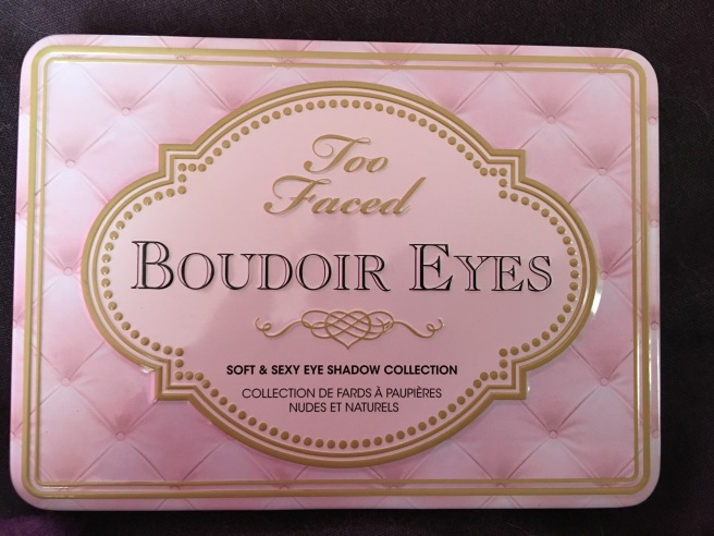
Today I will be looking at my Too Faced Boudoir Eyes Palette.


So this palette has been out for a while but I always seemed to find an excuse not to buy it. It’s a very cool toned palette and I don’t think I suit such shades and I never really heard many people rave about it either like they do with the natural eyes palette. But the package really called out to me and it’s so darn cute and since I had collected £30 worth of points on my Debenhams beauty club card I thought I would treat myself to it along with another palette.

The packaging is the newer tins from Too Faced and is really sleek and compact with a magnetic closure. It also has the print of an old style bed headboard but it looks so cute!


Inside the palette you have a mirror and the usual 9 pan layout you expect from the smaller Too Faced tin palettes. As you can see from the picture these are definitely cool toned shades! But the colours are really soft and dreamy that surprisingly look really beautiful on all skin tones.

I also love the shade names; Fuzzy Handcuffs, Garter Belt, Lap Dance…very saucy!


This is the top row in the palette.

In The Buff – Matte bone colour. The texture is a little chalky but it is pigmented and looks great once it’s on the eye. I use this as an all over base to brighten my eyes and to set my primer as well as a brow bone highlight.

Fuzzy Handcuffs – Matte peach shade. This is not as chalky as the previous shade. I use this as an all over lid colour if I want a matte shade but it would also look beautiful as a light transition shade on paler skin tones.

Voulez-Vous – Satin taupey purple shade. This can be used as an all over lid colour for a more smoky look but I usually use it to deepen up the crease or put in on the outer corner of my eye for a day time smoky look.

Natural light 

With flash

Top – In the Buff

Middle – Fuzzy Handcuffs

Bottom – Voulez-Vous

Middle Row

Satin Sheets – Peachy pink with gold shimmer. I use this shade as on my lid as it looks amazing but it would look equally great as a brown bone highlight on deeper skin tones. It’s not the most pigmented shade so I do find I need to build it up but I don’t mind as it’s one of the bigger pans.

Sugar Walls – Shimmery pink with purple tones and tiny flecks of silver glitter. This shade looks awesome on all skin tones as a lid colour. It will look different on everyone and will look darker on paler skin tones and the opposite on deeper tones. Although it is more pigmented than Sarin Sheets, it may still need to be built up depending on the opacity you are looking for.

Garter Belt – Matte grey shade with brown undertones. This colour scared me the most from the palette as it is very cool toned but I must say it’s the perfect transition/crease shade for a look created with the other colours. It is also highly pigmented.


Natural light


With Flash

Top – Satin Sheets

Middle – Sugar Walls

Bottom – Garter Belt
Bottom Row


Birthday Suit – Taupey gold shimmer shade. Another colour that can be used all over the lid or as a brow bone highlight for deeper complexions. Again, it’s very sheer so you may want to build it up.

Lap Dance – Taupe shimmer shade. This is my go to shade for a slightly more intense day time smoky look for a casual day event. I place this on my lid and smoke it out with garter belt and and Voules-Vous. It has decent pigmentation so I just swipe it on but you can build it up to be more vibrant.

French Tickler – Matte black with gold glitter. This is an intensely pigmented shade! It feels quite grainy when it is swatched but I suppose that’s due to the glitter particles. I’ve never tried it in the crease but I have used it to smoke out my lower lash line as well as pushing it on to my upper lash line to make my lashes look fuller and thicker. It can also be used as an eyeliner and all over the lid for a true black smokey eye and it would look stunning!


Natural light


With flash

Top – Birthday Suit

Middle – Lap Dance

Bottom – French Tickler
Swatches of all the shadows…

Natural light vs Flash

Top to bottom:

  1. In The Buff
  2. Fuzzy Handcuffs
  3. Voulez-Vous
  4. Satin Sheets
  5. Sugar Walls
  6. Garter Belt
  7. Birthday Suit
  8. Lap Dance
  9. French Tickler

I love this palette and I definitely recommend checking it out. I got mine from Debenhams (£29) and I’m sure it’s a permanent palette as it’s been around for ages. This palette has got me more into cool toned eyeshadows and I love the quality of it (usual brilliant Too Faced stuff) and with a primer on the lids it lasts all day! Overall I give this palette a 9/10.
So there you go guys, my Too Faced Boudoir Eyes Palette review!
Have a nice day!

Sadiyah x


Palette haul!

So in my last post many months ago, I spoke about my 11 eyeshadow palettes I owned and I was meant to review them all for you but only managed to do 1 review of the too faced natural eyes palette here. I’ve been really busy with uni stuff and wasn’t able to post as much as I had hoped…sorry!

So in my review for the natural eyes palette I spoke about it not being the best in my collection. However, recently I’ve been pulling it out more and more and I am really liking it!

Anyways the purpose of this post is to introduce you to all my new palettes I acquired over the last few months.

In my last post I showed you these palettes…


I recently bought these palettes…


Now my collection has grown to this size..
I now have 18 in total. I have my bobbi brown shimmer brick in this picture but I don’t really consider it a palette as its more of a highlighter although you could use it as eyeshadow.

I want to review all of my palettes and share my thoughts on them with you so if there is a palette you’re after you can read my review. I won’t be posting palette reviews in one go as I have other bits to post such as the new mac lipsticks I added to my collection as well as other high end lipsticks and makeup.

I do want to get more palettes even though I am well aware I already have more than most but the collector in me wants them all! It sucks living in the UK where you can’t buy brands such as Kat Von D, Anastasia Beverley Hills, Lorac and Tarte as they are the brands I want to try the most! #weneedasephoraintheuk

Let me know which palettes are your favourites and which you think I should try next!